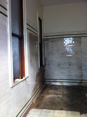
If you have been following me on Twitter (@elizabethhome) or on Facebook, you have probably seen your share of posts on my room at the Junior League of Boston's 35th Show House, but now that it is up and running and has been professionally photographed, I am finally revealing it here for the rest of the world to see...The room that I was given at the House was originally an annex to the kitchen. In the 8'x18' space, there were two refrigerators and a walk-in freezer. The original subway-tiled walls were stained and in disrepair, and the room was void of any architectural elements as seen throughout the estate.

When the League asked me to create a "mother's den", I immediately knew that I needed to warm up the space and make it feel as if it was a part of the main house. I wanted to bring the 11'4" ceiling height down and cozy up the awkward proportions. By introducing board-and-batten designs that were already found throughout the house, the room became more interesting and less disconnected. Painting it Dill Pickle green from Benjamin Moore then set the stage for its theme.
Green is an omnipresent color in the natural world, making it an ideal backdrop in interior design. It offers a sense of renewal, self-control, and harmony. In show business, the space in a venue where performers are held before they are needed on stage is called "the green room". It functions as a waiting room and a lounge before and after the show. Given that this space is right off of the kitchen in what would be a busy household, we have created a literal "green room"; a behind-the scenes space for a mother to decompress and await her motherly duties; a calm and tranquil place to recharge in between tasks. Mixing organic elements such as grass cloth and linen into a preppy palette of apple green, aqua, and lilac has made this room light and feminine; a special spot intended only for the woman of the house.
Some fun things to note about the space are:
Everything is for sale, even the monogrammed rainboots if your initials are eBr.
The piece of art that you see on the far wall is actually a fabric by Manuel Canovas. The repeat is so large, that I view it as art and framed it accordingly. It also doubles as a full-sized headboard and has been upholstered as such.
The high gloss "surf" artwork is made by a local artist named Karole Moe. Each piece is created with upcycled house paint and finished with liquid glass.
There is a huge play on plaids in the room. The pair of chairs are the vintage chairs that you read about here - http://spacetograce.blogspot.com/2012/03/just-by-chance.html - and they have been completely restored and reupholstered in a gorgeous Cowtan & Tout fabric. Plaid is also found on the back of the "rope" chair, on the floor, on the ceiling, and on the custom ottoman...
The lighting fixtures are by Stray Dog Designs and are made of paper-mache.
The Green Room is an interior room, and the windows in the space actually look right into another room. To hide this, we took photographs of the property and inset them into the backside of the window frame.
If you can, come have a look for yourself - The JLB Show House is running through November 18th.


Elizabeth, your space is one of the greatest transformations in the entire house! You did an unbelievable job -- the ceiling is one of my favorite elements in your design. It was an incredible process to watch!
ReplyDelete