My client had a demure, baby blue, occasional chair (that I wish I took a before picture of) that was so old it actually rocked in every direction when you sat in it. It went from her husband's grandmother's house, to her own bedroom, to her daughter's room, and still couldn't find a comfortable resting place. A little nook in her music room was waiting for seat, so I suggested moving it down there. I had my favorite, and most talented, upholsterer sure up the frame, and we put a BIG, BOLD graphic pattern on it. Now it's the highlight of the space.
Another element to point out here is how small frames don't necessarily need small patterns. We are making a big statement in a small place by using a large scale print in an unexpected way. The best part about it is how the pattern is matched up from the seat back, down the seat, and onto the skirt. Where the pattern couldn't be matched, we simply pleated the corners and gave the eye a distraction; this is why you need a trustworthy upholstered who knows what they're doing (and mine is Olger).
Here is the chair up for inspection in the workroom:
Here it is in the music room:
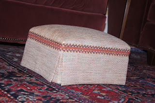
Here is the footstool I had made to go with it:
Or with the chair in the neighboring room (my idea of cohesive design from a past post):


No comments:
Post a Comment